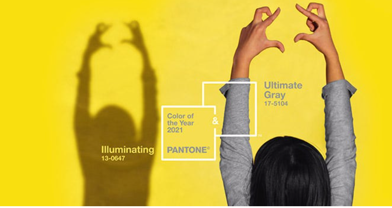
Pantone picked two shades as The 2021 Colour Of The Year, so what do we think about Pantone’s choice of colours for next year?

For over 20 years, Pantone’s Colour Of The Year has influenced interior designers, product development, fashion and art. Every December, we look forward to the yearly announcement of what colour Pantone has chosen as its Colour of the Year.
To decide on the colours, the selection process requires thoughtful consideration and trend analysis throughout the year within the industries.
But with 2020 being nothing short of the unknown, Pantone also decided to change it up a bit by selecting two different shades as the 2021 Colour of The Year. This is the first time since 2016 that Pantone has decided upon two shades for the Colour Of The Year 2021.
After many months of brands releasing their own predictions of what the new colour will be, Pantone finally has revealed their choice. The two Pantone colours are revealed as PANTONE 17-5104 Ultimate Gray and PANTONE 13-0647 Illuminating.
The two independent colours were brought together to highlight how different elements can support each other. The combination of these two colours represent strength and positivity.
"The union of an enduring Ultimate Gray with the vibrant yellow Illuminating expresses a message of positivity supported by fortitude," says Leatrice Eiseman, executive director of the Pantone Colour Institute. "Practical and rock solid but at the same time warming and optimistic, this is a colour combination that gives us resilience and hope. We need to feel encouraged and uplifted; this is essential to the human spirit."
Choosing a grounding gray shade that is paired with a bright happy yellow conveys "a message of strength and hopefulness that is both enduring and uplifting," according to Pantone. The entire world needs to feel that everything will be getting better and brighter in the year of 2021.
What Do Our Designers Think Of Pantone’s Colours?
The “Ultimate Gray” portrays natural elements, such as stone, bringing a feeling of steadiness, resilience and strength which we try to represent through our designs and projects across Zoco Home.

Regarding the “Illuminating” colour, we incorporate this colour into our design in a different way than other designers. We are lucky enough to have the colour represented through the place where we work and live in the South of Spain. We have the sunshine all year round which represents Pantone’s “illuminating” colour.
With the “Ultimate Gray” colour that sets the mood in any room, together with the Costa Del Sol sunshine that represents the “Illuminating” colour it completes any home, adding positivity to your home.
How Can We Implement The “Ultimate Gray” Pantone Colour Into Our Homes?
One way to take inspiration from the Pantone colours is through your home. If you are unsure how to incorporate these colours, consider these tips from our interior designers.
Furniture
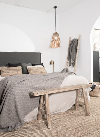
Using the “Ultimate Gray” as the more prominent colour in your furnishings, such as on sofas and walls provide any space with a sense of elegance. The “Ultimate Gray” colour is a neutral hue, meaning it can be combined with any colour scheme you wish to have in your home.

Using gray as the colour of your furnishing, such as your sofas can make it easy to style up in a Scandinavian boho inspired style.
Using Textiles
Adding textiles throughout your home, such as throw pillows and throw blankets can create the perfect cozy winter home. You can lighten the look with a draped blanket and throw on a few pillows until you have the perfect blend of various textures in a neutral palette.

Adding cushions is a simple way to update your room and to use Pantones “Ultimate Gray” colour scheme of 2021 throughout your home, whether that is in the bedroom or the living space.
Home Offices
With remote working now becoming a trend in itself due to the Coronavirus pandemic, having a dedicated work space in your home will help you set aside any distractions and focus on your work.
Make working from home work for you by implementing the Pantone’s “Ultimate Gray” colour in your home office. Additionally, try incorporating our idea of the “Illuminating” sunshine colour through the use of daylight and calming lighting throughout the space.

These colours will assure and encourage feelings of positivity while working remotely in the comfort of your own home.

To conclude, the pairing of Pantone 17.5104 Ultimate Gray and Pantone 13-0647 will highlight our need to be visible, to be recognised and to radiate positivity throughout the year of 2021.
Will you be implementing the new Pantone Colours of The Year to your home?
If you are looking to upgrade your home in the new year, we can create your perfect home with our Scandinavian inspired home decor and furniture, as well as providing professional interior design services.
Contact us at info@zocohome.com for more information on our products and services. We look forward to helping you create perfect spaces.

Share:
Do This To Create The Perfect Cozy Winter Home
How To Make 2021 Your Best Year